Archive for the ‘Uncategorized’ Category

Small Facelift

Wednesday, August 13th, 2008

I got tired of the old look of 2vi.nl and decided to go for a quick facelift.   Basically I have removed a lot of excessive layout and information  and tuned some of the colors a bit more towards orange instead of the hard red it was.    Overall I believe it looks less agressive and better reflects the type of websites I design.

Hard choices

Monday, June 23rd, 2008

I know, you can’t keep everybody happy,  but it still feels like the best thing to do most of the time.  However, keeping everybody happy by adding more and more features to PicturePush made us run out of resources soon, making the site slower. We would have to add extra resources, making the business unhealty…  The Free model just does not work very well for us in terms of income.   Last week we almost ran out of storage space, forcing a hard decision:  closing uploads or do a major investment. We choose to do something in between: We will expand storage capacity with minor means,  but also put severe restrictions onto the Free membership level.   It won’t harm the existing wealth of photos stored there, but it does restrict new uploads to 200 MB per month.

This choice will probably slow the growth of our service down and might even cause some of our members to leave unhappy.  However, it will also make PicturePush a more healthy undertaking, making it future proof in terms of growth and self support.  In the long run we will be able to offer a service of much higher quality to those members that really value our offe

Pink Stones

Tuesday, April 8th, 2008

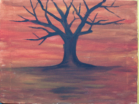
So what do you do with a pink stone? Well, you could turn it into something like this:

Image Hosted by PicturePush

I have just finished this second project. You can see intermediate steps at my PicturePush album.

I’m not sure yet, whether I’m completely happy with the result, so I might change it a bit later or just leave it as an experiment.

Illustrations

Wednesday, February 27th, 2008

Last week we came up with the idea of adding a nice illustration to the MovingLabs website which would give a good impression of what it is all about. Normally we would just select some stock photo, but I decided to give it a try myself.

The first attempt was using a paper and pen:
Image Hosted by PicturePush - Photo Sharing

I did not get the right atmosphere, we are not a fat and lonely scientist. We are young, experimental and moving. A second attempt followed:
Image Hosted by PicturePush - Photo Sharing

That’s better… but we can’t put a ballpoint sketch on our website, can we? So I took a photo to digitize it and used it as a background in Adobe Illustrator. A few hours later it ended up like this:
Image Hosted by PicturePush - Photo Sharing

Which is what you currently see on the website. Although I definitely should practice some more, overall I do think it came out nice and serves it’s purpose.

Hello world!

Tuesday, February 26th, 2008

This blog will be there for you to refer you to all my online activities as well as for publishing thoughts that do not fit in elsewhere.